This project's goal was to boost a new revenue stream for Wacom by revamping the product registration process, so users can easily activate their software bundle.
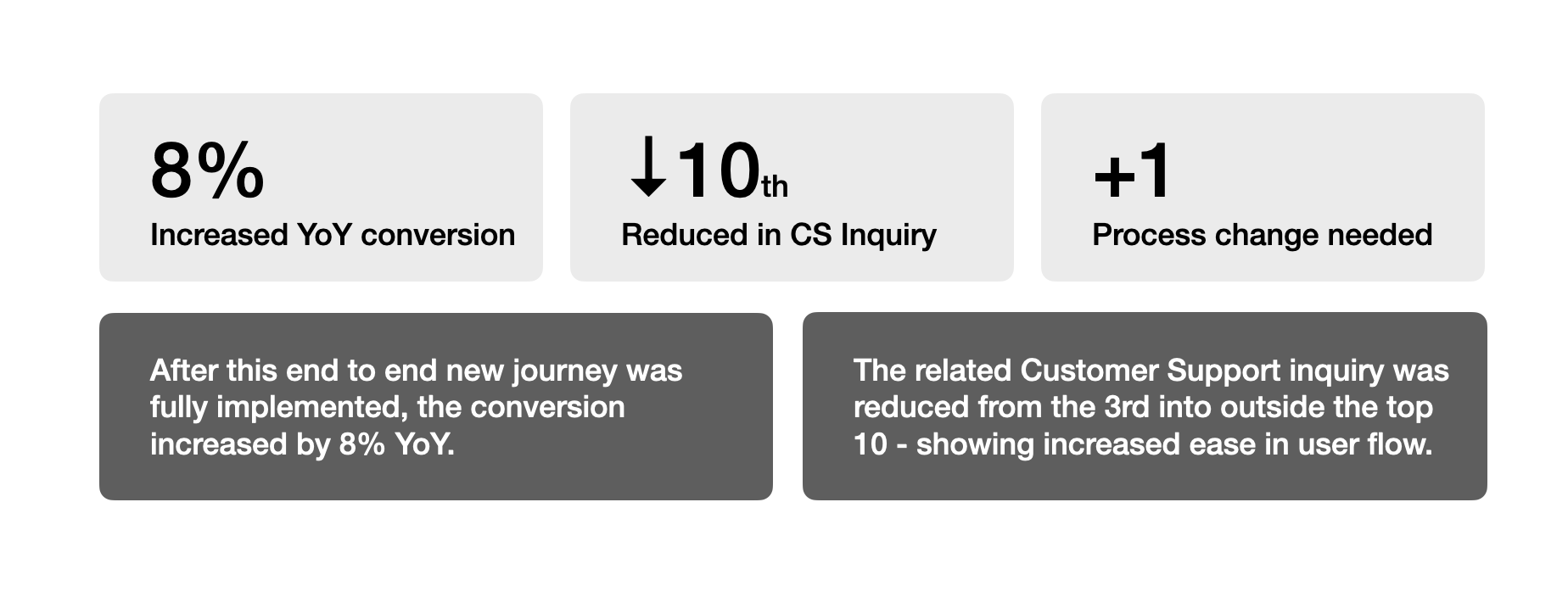
After the new user flow was implemented, conversion successfully increased by 8%, and customer support inquiries dropped from being the 3rd highest issue to outside the top 10.
Project Overview
(2023)
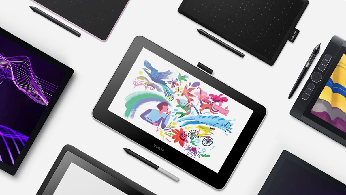
As a drawing pen tablet company, Wacom offers software bundles for creative beginners to ensure they are equipped with the necessary software to start working. My role as UX Lead in Business Development team was to increase software as a new revenue stream by converting more Wacom users to register their product and activate their software bundle.
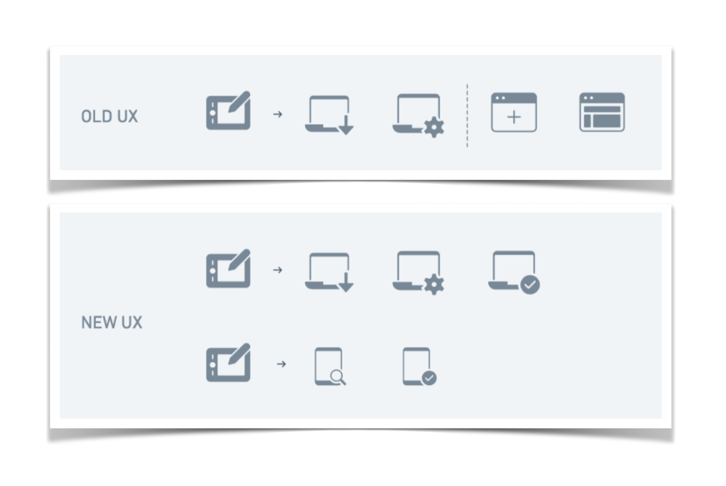
The previous process was complicated, consisting of 5 touch points. This complexity made it the 3rd highest customer support inquiry topic and resulted in sub-optimal conversion.
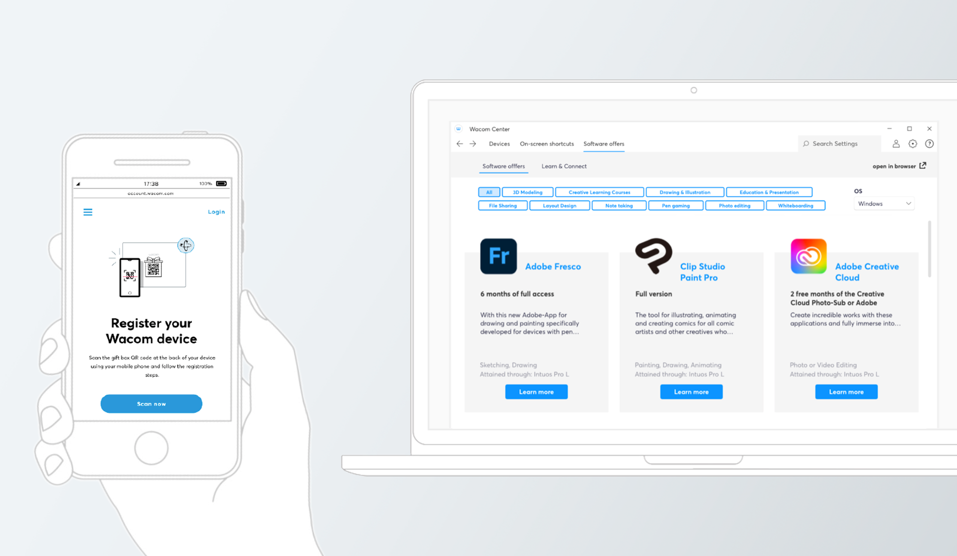
The new user journey reduced the number of steps from 5 to just 4 touch points. Additionally, users can now easily register their product by scanning a QR code via their mobile phone, completing the process within just 2 touch points.
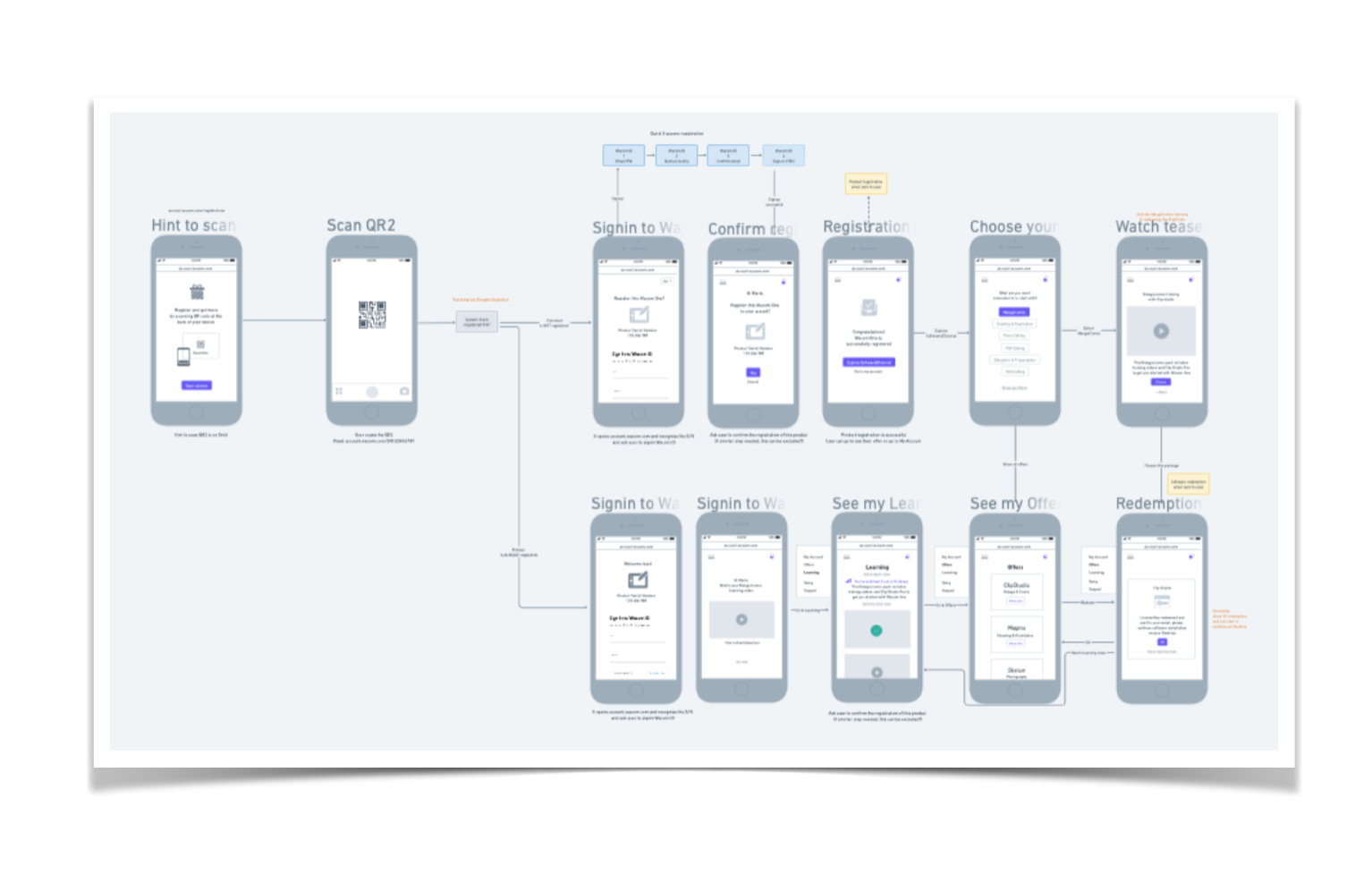
My role involved conducting usability studies and conversion analytics, creating customer journey flows and wireframes, and leading 2 product designers working on desktop native apps and web platforms.
Impact
After this new journey was fully implemented, conversion increased by 8% year-over-year. The related customer support inquiries were reduced from the 3rd highest issue to outside the top 10. This project also revealed the need for a process change from two teams to create an integrated experience and QA testing.
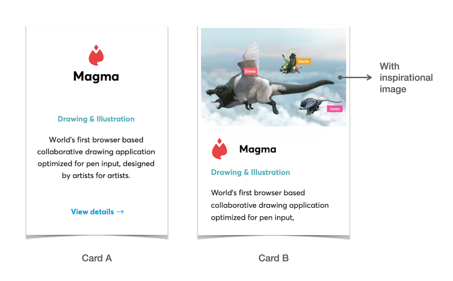
In addition to revamping the registration process, the software card was updated to further optimise conversion. So that it is easier for creative beginners to find software that matches their interests, images were added to the new card design.
Further Impact
As a result, this further increased conversion by 0.5%, which was validated through a month of pilot AB testing. Users now spend more time exploring the software offer list during each visit to the account page. The team learned from this project as a pilot AB testing initiative, establishing a framework to be utilised in the future.
Image credit: Wacom | UI Design: Galin Dimitrov & Jessica Priesmayer